Decision-making under uncertainty, a key aspect of risk management, frequently benefits from sensitivity analysis. @RISK, a leading software tool, facilitates sophisticated analyses, including tornado sensitivity analysis, by visualizing the impact of varying inputs on a target variable. The Project Management Institute (PMI) recognizes the value of such techniques for project planning and execution. Tornado sensitivity analysis, a crucial methodology, allows analysts to prioritize factors influencing outcomes, a concept deeply explored by Douglas Hubbard in his work on measuring and managing risk.
In an era defined by unprecedented data availability, the ability to extract meaningful insights and make informed decisions is paramount. Sensitivity analysis emerges as a critical methodology in navigating this complex landscape, offering a systematic approach to understand how various factors influence outcomes. It helps us move beyond simple correlations and delve into the cause-and-effect relationships that drive real-world phenomena.
Defining Sensitivity Analysis
At its core, sensitivity analysis is a technique used to determine how different values of an independent variable impact a particular dependent variable under a given set of assumptions. It explores the uncertainty in the output of a model or system due to uncertainty in its inputs. This process helps identify the most influential factors, allowing for focused attention and resource allocation.
Sensitivity analysis is not merely a theoretical exercise. It is a practical tool that allows us to quantify risk, test the robustness of models, and ultimately make more confident and effective decisions.
Enhancing Data-Driven Decision-Making
The modern decision-making environment demands agility and precision. Gut feelings and intuition, while valuable, must be augmented with data-driven insights. Sensitivity analysis empowers decision-makers by providing a clear understanding of the potential consequences of different choices.
By quantifying the impact of each variable, it enables prioritization, allowing for resources to be directed toward the areas where they will have the greatest effect. This leads to more efficient strategies and improved outcomes.
Furthermore, it helps to identify potential vulnerabilities and risks, allowing for proactive mitigation strategies to be developed. Sensitivity analysis transforms raw data into actionable intelligence, giving organizations a competitive edge.
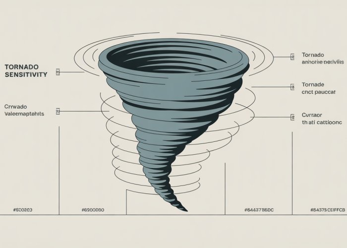
Tornado Diagrams: A Visual Powerhouse
Among the various techniques used for sensitivity analysis, the tornado diagram stands out as a particularly effective and intuitive tool. It provides a visual representation of the relative importance of different input variables on a specific output variable.
The diagram is structured in a way that resembles a tornado, with the most influential variables placed at the top and the least influential at the bottom. This visual hierarchy allows for a quick and easy understanding of the key drivers of a system.
The beauty of tornado diagrams lies in their simplicity. They communicate complex information in an accessible format, making them valuable for both technical experts and non-technical stakeholders. Tornado diagrams bridge the gap between data and understanding, fostering collaboration and informed decision-making across diverse teams.
Enhancing data-driven decision-making moves us beyond simply recognizing the importance of data. It requires understanding the tools available to dissect and interpret information effectively. One such invaluable tool is the tornado diagram, a visual representation that illuminates the intricate relationship between inputs and outputs within a system.
Decoding Tornado Diagrams: A Visual Guide
Tornado diagrams offer a powerful way to visualize the impact of various input variables on a specific output variable. By representing the sensitivity of the output to changes in each input, these diagrams provide a clear and concise view of the factors that most significantly influence the outcome.
This visual clarity is invaluable in identifying key drivers, prioritizing actions, and ultimately making more informed decisions.
Visualizing Variable Impact
At its core, a tornado diagram transforms complex data into an accessible visual format. Each input variable is represented by a horizontal bar, with the length of the bar indicating the degree to which changes in that input variable affect the output variable.
The variables are arranged vertically, with the most influential variable at the top and the least influential at the bottom, creating a distinctive "tornado" shape. This arrangement immediately highlights the critical few variables that warrant the most attention.
Anatomy of a Tornado Diagram
Understanding the components of a tornado diagram is essential for interpreting its insights effectively. The diagram revolves around three core elements: input variables, output variables, and their relationship.
Input Variables
Input variables are the factors that can be changed or manipulated within a system or model. These are the levers that decision-makers can potentially adjust to influence the outcome. Identifying the appropriate input variables is crucial for conducting a meaningful sensitivity analysis.
Output Variables
The output variable is the specific metric or outcome that is being analyzed. It is the dependent variable that is influenced by changes in the input variables. The goal of the tornado diagram is to quantify and visualize how each input variable affects this key output.
The Input-Output Relationship
The length of each bar in the tornado diagram represents the sensitivity of the output variable to changes in the corresponding input variable.
A longer bar indicates a greater impact, meaning that even small changes in that input variable can lead to significant changes in the output.
Conversely, a shorter bar indicates a less sensitive relationship.
The Significance of Uncertainty
Uncertainty is an inherent part of any real-world system or model. Tornado diagrams help to visualize and understand this uncertainty by representing the range of possible values for each input variable.
This is typically done by defining a minimum and maximum value for each input, and the bar in the diagram extends between the output values calculated using these extreme values.
The wider the range of possible outcomes for a given input variable, the greater the uncertainty associated with that variable’s impact. By visualizing this uncertainty, tornado diagrams allow decision-makers to assess the potential risks and opportunities associated with different choices. Understanding the limitations and possible variations informs robust strategy development.
Building Your Own Tornado Sensitivity Analysis: A Step-by-Step Approach
Having grasped the fundamentals of tornado diagrams and their interpretive power, we now turn our attention to the practical application: constructing your own tornado sensitivity analysis. This involves a systematic approach, focusing on the crucial steps of identifying key variables, quantifying uncertainty, and structuring your data for optimal visualization. This hands-on process empowers you to unlock the full potential of this analytical tool.
Defining Your Model: Identifying Key Input and Output Variables
The first step in building a tornado diagram is to define a clear and concise model.
This involves pinpointing the critical input variables that exert a significant influence on your chosen output variable.
Identifying the output variable is often the easier part.
It is the key performance indicator (KPI) or metric you’re trying to understand and potentially influence. This could be anything from project profitability to customer satisfaction scores.
The selection of relevant input variables, however, requires a deeper understanding of the system you’re analyzing. Consider conducting brainstorming sessions with subject matter experts. Consult historical data, and explore existing research to identify the factors that demonstrably affect your output variable.
For example, when analyzing project profitability (output), input variables might include labor costs, material expenses, and projected sales volume.
Remember to limit the number of input variables to the most influential ones.
Overcrowding the diagram with too many variables can dilute its impact and obscure critical insights.
A good rule of thumb is to focus on the top 10-15 most impactful variables.
Quantifying Uncertainty: Defining Range of Values
Once you’ve identified your key variables, the next step is to quantify the uncertainty associated with each input variable.
This involves determining an appropriate range of values for each one, reflecting the potential variability or fluctuation that each variable might experience.
Avoid using single-point estimates for your input variables, as these don’t reflect the real-world uncertainty inherent in most business scenarios. Instead, define a minimum and maximum value for each input, representing the plausible lower and upper bounds of its potential range.
There are several methods for determining these ranges:
-
Historical Data: Analyze past performance to identify the typical range of values for each input variable.
-
Expert Opinion: Consult with subject matter experts to gather their insights on the potential variability of each input.
-
Statistical Analysis: Employ statistical techniques, such as standard deviation or percentile analysis, to quantify the range of values based on available data.
The chosen range should be realistic and based on justifiable assumptions.
Avoid overly optimistic or pessimistic ranges that could skew the results of your analysis.
For instance, if you are estimating labor costs, consider factors such as potential overtime, unexpected delays, or changes in labor rates when defining the minimum and maximum values.
Structuring Data for Easy Visualization
The final step is to structure your data in a format that facilitates easy visualization and the creation of the tornado diagram.
Typically, this involves creating a spreadsheet or table with the following columns:
- Input Variable: The name or description of the input variable.
- Minimum Value: The lowest plausible value for the input variable.
- Maximum Value: The highest plausible value for the input variable.
- Base Value: The most likely or expected value for the input variable.
- Output Value (Minimum): The resulting output value when the input variable is set to its minimum.
- Output Value (Maximum): The resulting output value when the input variable is set to its maximum.
You will need to calculate the Output Value (Minimum) and Output Value (Maximum) for each input variable.
This can be achieved by plugging the minimum and maximum values of each input into your model or equation, while holding all other input variables constant at their base values.
Organizing your data in this structured format will allow you to easily import it into a charting tool, such as Microsoft Excel, Google Sheets, or specialized sensitivity analysis software, to generate your tornado diagram. This structured approach ensures a clean and readily interpretable visual representation of your sensitivity analysis results.
Having established the method for constructing a tornado diagram, the next crucial step lies in deciphering its visual narrative and translating it into actionable strategies. A well-constructed tornado diagram is not merely a display of data; it’s a roadmap for prioritizing actions and making informed decisions.
Interpreting and Leveraging Tornado Diagrams for Strategic Insights
The real power of a tornado diagram emerges when you can translate its visual representation into strategic actions. By understanding how to identify key drivers, prioritize actions, and inform decision-making, you can unlock the full potential of this analytical tool.
Identifying Key Drivers: The Length of the Bars
The most immediate insight derived from a tornado diagram is the identification of key drivers. These are the input variables that exert the most significant influence on the output variable. Visually, they are represented by the longest bars in the diagram.
The length of each bar corresponds to the extent of change in the output variable resulting from the defined range of uncertainty in the input variable. A longer bar signifies a more substantial impact.
Therefore, the variables associated with the longest bars are the ones that warrant the most attention.
Understanding this is fundamental to prioritizing your efforts.
Prioritizing Actions Based on Impact
Once the key drivers are identified, the next step is to prioritize actions based on their degree of impact. Not all variables are created equal, and focusing on those with the highest impact yields the most effective results.
Impact Assessment
The tornado diagram provides a clear visual hierarchy of impact. Focus your initial efforts on managing and mitigating the uncertainty associated with the variables represented by the longest bars.
This might involve gathering more data to narrow the range of uncertainty, implementing control measures to stabilize the variable, or developing contingency plans to address potential adverse outcomes.
Resource Allocation
Resource allocation should align with the degree of impact. Allocate more resources to managing the variables that have the potential to significantly affect the output variable. This ensures that your efforts are focused on the areas where they can make the biggest difference.
Strategic Interventions
Consider strategic interventions to influence the key drivers in a favorable direction. If a particular input variable has a significant positive impact on the output variable, explore ways to enhance that impact. Conversely, if a variable has a negative impact, focus on mitigating its effects.
Informing Decision-Making and Strategic Planning
The insights derived from a tornado diagram should be used to inform decision-making and strategic planning. The diagram provides a clear understanding of the factors that are most likely to influence outcomes, allowing you to make more informed choices.
Scenario Planning
Use the tornado diagram to develop scenario plans. Consider the best-case, worst-case, and most likely scenarios for the key drivers. This allows you to prepare for a range of potential outcomes and develop strategies to mitigate risks and capitalize on opportunities.
Risk Mitigation
Identify the variables that pose the greatest risk to achieving your desired outcome. Develop mitigation strategies to address these risks. This might involve implementing controls, diversifying your approach, or purchasing insurance.
Strategic Alignment
Ensure that your strategic plans are aligned with the insights derived from the tornado diagram. Focus on initiatives that address the key drivers and enhance the factors that contribute to success.
By integrating the insights from tornado diagrams into your decision-making processes, you can enhance your ability to navigate uncertainty, manage risks, and achieve your strategic objectives.
Project Management Applications: Integrating Tornado Analysis for Enhanced Risk Assessment
Having established the method for constructing a tornado diagram, the next crucial step lies in deciphering its visual narrative and translating it into actionable strategies. A well-constructed tornado diagram is not merely a display of data; it’s a roadmap for prioritizing actions and making informed decisions.
The world of project management thrives on predictability, yet it constantly battles uncertainty. Integrating tornado sensitivity analysis offers a powerful means to navigate this complex landscape, allowing project managers to proactively assess risks, make informed decisions, and ultimately improve project outcomes.
Proactive Risk Assessment in Project Management
Traditional risk management often relies on reactive strategies, addressing issues as they arise. Tornado diagrams, however, enable a proactive approach by identifying the variables that have the most significant impact on project goals before they become critical problems.
By visually representing the sensitivity of project outcomes to different input variables – such as resource costs, task durations, or market fluctuations – tornado diagrams allow project managers to focus their attention on the areas where focused mitigation efforts will yield the greatest benefit.
This forward-looking perspective is invaluable in developing contingency plans and allocating resources effectively.
Informing Decision-Making Throughout the Project Lifecycle
The benefits of integrating tornado analysis extend beyond the initial risk assessment phase. Throughout the project lifecycle, from planning and execution to monitoring and control, the insights gained from these diagrams can inform critical decisions.
-
Resource Allocation: By understanding which tasks or resources have the most significant impact on project timelines and budgets, project managers can allocate resources more strategically.
-
Scenario Planning: Tornado diagrams can be used to evaluate the potential impact of different scenarios, such as delays in key deliverables or changes in market conditions. This allows project managers to develop proactive strategies to mitigate potential negative consequences.
-
Change Management: When unexpected changes arise, tornado diagrams can help assess the impact of these changes on project outcomes and inform decisions about whether to accept, reject, or modify the proposed changes.
Improving Project Outcomes by Managing Critical Variables
Ultimately, the goal of integrating tornado analysis into project management is to improve project outcomes. By identifying and managing the critical variables that drive project success, project managers can increase the likelihood of achieving their objectives.
This involves several key steps:
-
Prioritizing Monitoring Efforts: Focus on closely monitoring the variables identified as having the greatest impact on project outcomes, allowing for early detection of potential problems.
-
Developing Targeted Mitigation Strategies: Implement specific strategies to mitigate the risks associated with the most sensitive variables, such as securing backup suppliers for critical materials or cross-training team members on essential tasks.
-
Continuously Refining the Analysis: As the project progresses and new data becomes available, update the tornado diagram to reflect the evolving risk landscape. This ensures that decision-making remains informed and aligned with the project’s goals.
By actively managing these critical variables, project managers can increase the probability of project success, delivering projects on time, within budget, and to the required quality standards.
Enhancing Analysis with Monte Carlo Simulation
While tornado diagrams offer a powerful visual representation of variable sensitivity, they operate under certain assumptions. Primarily, they analyze the impact of changing one variable at a time, while holding all others constant. In reality, multiple variables often fluctuate simultaneously, potentially influencing each other. This is where Monte Carlo simulation steps in to provide a more comprehensive and nuanced understanding of risk and uncertainty.
Monte Carlo simulation, a computational technique that uses random sampling to obtain numerical results, allows us to model the complex interplay of numerous variables under various conditions. By generating a multitude of potential scenarios, it provides a more robust assessment of variable impact compared to the deterministic nature of standard tornado diagrams.
Generating Multiple Scenarios with Monte Carlo
The core strength of Monte Carlo simulation lies in its ability to generate a vast number of plausible scenarios. Here’s how it works:
-
Define Input Variables and Distributions:
Instead of fixed ranges, each input variable is assigned a probability distribution (e.g., normal, uniform, triangular) reflecting its potential values and their likelihood. -
Run Iterations:
The simulation runs thousands of iterations, each time randomly sampling values from the defined distributions for all input variables. -
Calculate Output:
For each iteration, the model calculates the output variable based on the sampled input values. -
Analyze Results:
The results are then analyzed to determine the range of possible outcomes, their probabilities, and the sensitivity of the output to changes in the input variables.
This process creates a distribution of possible outcomes, providing a more realistic picture of the potential risks and opportunities associated with a project or decision.
Validating Tornado Diagrams with Monte Carlo Data
The data generated from a Monte Carlo simulation can be invaluable in validating the results obtained from a tornado diagram. This validation process can be approached in several ways:
-
Correlation Analysis:
Calculate the correlation coefficients between each input variable and the output variable from the Monte Carlo simulation data. These coefficients indicate the strength and direction of the relationship. Compare these correlations to the variable rankings in the tornado diagram. Significant discrepancies may suggest limitations in the tornado diagram’s assumptions. -
Scenario Testing:
Use specific scenarios generated by the Monte Carlo simulation to test the sensitivity of the output variable to simultaneous changes in multiple input variables. This helps to identify potential interaction effects that are not captured in the tornado diagram. -
Distribution Comparison:
Compare the distribution of the output variable generated by the Monte Carlo simulation to the single-point estimate used in the tornado diagram. Significant differences may indicate that the tornado diagram is underestimating the true range of possible outcomes.
By comparing the insights derived from each approach, analysts can refine their understanding of the underlying drivers of risk and uncertainty.
Joint Efforts: A Robust Approach to Risk and Sensitivity Analysis
When used in conjunction, tornado diagrams and Monte Carlo simulations provide a powerful and comprehensive approach to risk and sensitivity analysis. Tornado diagrams quickly highlight the most influential variables, while Monte Carlo simulation validates those findings and provides a more realistic assessment of potential outcomes.
This combined approach allows for a more informed decision-making process, leading to better risk management and improved project outcomes. For instance, if the Monte Carlo simulation reveals that certain combinations of variables can lead to particularly adverse outcomes, even if those variables are not ranked highest in the tornado diagram, project managers can implement targeted mitigation strategies to address those specific risks.
By integrating these two techniques, organizations can move beyond simple sensitivity analysis to a more robust and reliable understanding of the complex factors that can impact their success. This leads to more confident and resilient strategies in an increasingly uncertain world.
Tornado Sensitivity Analysis: Frequently Asked Questions
Here are some common questions about tornado sensitivity analysis to help you better understand this powerful risk management tool.
What exactly is tornado sensitivity analysis?
Tornado sensitivity analysis is a technique used to understand how different input variables affect the outcome of a model. It helps identify which variables have the biggest impact, resembling a tornado diagram in its visual representation. This allows for focused attention on the most critical factors.
Why is tornado sensitivity analysis important?
It’s important because it allows you to identify the key drivers of your project’s success or failure. By understanding which variables have the most influence, you can prioritize risk mitigation efforts and make more informed decisions. Ignoring key sensitivities can lead to inaccurate predictions and poor outcomes.
How does tornado sensitivity analysis differ from other sensitivity analyses?
Unlike other sensitivity analyses that might test variables individually or in a less structured way, tornado sensitivity analysis focuses on the range of each variable. This provides a clear visualization of the relative impact of each variable, making it easy to see which ones are most critical.
When should I use tornado sensitivity analysis?
Tornado sensitivity analysis is particularly useful when dealing with complex models with many input variables. It’s best applied early in the decision-making process, or whenever you need to understand which factors are most influencing the outcome of a project or model, allowing you to strategically refine your assumptions and manage risk.
Alright, that’s a wrap on tornado sensitivity analysis! Hopefully, you’ve got a better handle on how to use it. Go forth and analyze!