The Gall-Peters projection, as advocated by organizations like UNESCO for promoting equity, represents land areas accurately, a direct contrast to the shape distortions common in the more familiar Mercator projection. The Peters projection map, championed by historian Arno Peters, aimed to correct perceived Eurocentric biases inherent in traditional mapmaking. Therefore, the peter projection map is considered by some cartographers a crucial tool for decolonizing geographical representation and promoting a more balanced global perspective in classrooms and atlases.
Imagine a world map, a seemingly straightforward representation of our planet. But what if that map, the very lens through which we view global relationships, is subtly skewed? The truth is, every map projection is a deliberate distortion, a compromise between accurately representing the Earth’s spherical surface on a flat plane.
No map is without bias, and understanding these biases is crucial to interpreting the world around us.
The Inevitable Distortion of Map Projections
Map projections are essential tools. They allow us to navigate, plan, and understand spatial relationships. However, the process of flattening a sphere inevitably introduces distortion. Imagine peeling an orange and trying to lay the peel flat without tearing or stretching it. The same principle applies to mapping the Earth.
There are many different map projections, each with its own set of strengths and weaknesses. Some preserve area accurately, while others prioritize shape or distance. The choice of projection depends entirely on the map’s intended purpose.
Introducing the Peter Projection Map
The Peter Projection Map, also known as the Gall-Peters Projection, is a rectangular map projection that attempts to correct the distortions inherent in other world maps. Proposed by Arno Peters in 1973, it quickly became a symbol of geographical justice.
The Peter Projection Map is designed to accurately represent the area of landmasses. Unlike the more common Mercator Projection, which exaggerates the size of countries in the Northern Hemisphere, the Gall-Peters Projection ensures that each country’s size is proportionally correct.
This equal-area projection aimed to challenge the Eurocentric bias prevalent in many traditional maps, particularly the Mercator Projection, which visually inflates the size and importance of Europe and North America.
Purpose and Scope of This Exploration
This article aims to delve into the complex world of the Peter Projection Map, exploring its history, design, and the controversies it has sparked. We will examine its key features, the arguments for and against its use, and its lasting impact on cartography and our understanding of global relationships.
By unpacking the story of the Peter Projection Map, we can better understand the inherent biases in all map projections and their impact on our perception of the world. Join us as we dissect this iconic map and uncover the truth behind its enduring legacy.
Imagine a world map, a seemingly straightforward representation of our planet. But what if that map, the very lens through which we view global relationships, is subtly skewed? The truth is, every map projection is a deliberate distortion, a compromise between accurately representing the Earth’s spherical surface on a flat plane.
No map is without bias, and understanding these biases is crucial to interpreting the world around us.
Understanding the Basics: What are Map Projections?
To truly grasp the significance of the Peter Projection Map, we must first understand the fundamental principles behind all map projections. What is a map projection, and why is it such an integral part of our understanding of the world?
At its core, a map projection is a systematic transformation of the latitudes and longitudes of locations from the surface of a sphere or ellipsoid into locations on a plane. Simply put, it’s a method of flattening the Earth.
Think of it like trying to flatten an orange peel onto a table. You can’t do it without tearing, stretching, or otherwise distorting the peel. The same applies to the Earth; its spherical shape makes perfect representation on a flat surface impossible.
The Necessity of Imperfection
Despite these inherent flaws, map projections are absolutely essential. We need them for navigation, urban planning, resource management, and countless other applications.
Imagine trying to navigate using a globe while driving a car! Flat maps are practical. They allow us to easily measure distances, calculate routes, and visualize spatial relationships in a way that a globe simply cannot.
The key lies in understanding that all map projections involve distortion. It’s not a question of whether a map is perfect, but rather which distortions are acceptable for a particular purpose.
The Challenge of Distortion
The act of projecting a 3D surface onto a 2D plane inevitably introduces four primary types of distortion:
- Area: The relative size of geographic features may be altered.
- Shape: The angular relationships within geographic features may be distorted, making them appear stretched or compressed.
- Distance: The distance between points on the map may not accurately reflect the true distance on the Earth’s surface.
- Direction: The direction or bearing between points may be misrepresented.
Different map projections prioritize different properties. Some strive to preserve area, while others focus on maintaining accurate shapes or distances. No single projection can perfectly preserve all four.
Area vs. Shape Distortion
Two key types of distortion are particularly relevant when discussing the Peter Projection Map: area distortion and shape distortion.
Area Distortion refers to the misrepresentation of the relative sizes of geographic features. A map with significant area distortion might make one country appear much larger or smaller than it actually is in relation to others.
Shape Distortion involves altering the angular relationships and overall forms of geographic features. This can result in countries or continents appearing stretched, compressed, or otherwise misshapen. The choice between minimizing area distortion and shape distortion is a fundamental trade-off in map projection design.
No introductory or concluding remarks needed.
The Gall-Peters Projection: A History of Controversy
The quest for a perfect map projection, free from bias and distortion, is a Sisyphean task. We’ve established the inherent challenges in representing a sphere on a flat surface. Now, let’s examine the historical context and motivations behind one of the most controversial attempts to tackle this problem: the Gall-Peters Projection.
Arno Peters: The Man Behind the Map
Arno Peters was a German historian and cartographer, not a trained geographer. This distinction is crucial, as it shaped his perspective and approach to mapmaking.
He believed that traditional map projections, particularly the Mercator, perpetuated a Eurocentric worldview that marginalized the developing world. He sought to create a map that would correct these perceived imbalances and offer a more equitable representation of the planet.
Peters argued that the Mercator projection, with its emphasis on preserving shape, distorted the relative sizes of countries. This, he claimed, led to a skewed perception of global power dynamics.
Challenging Eurocentrism: A Matter of Perspective
The historical context surrounding the Gall-Peters Projection is deeply intertwined with the critique of Eurocentric cartography. For centuries, the Mercator projection, designed for navigational purposes, had dominated world maps.
While invaluable for sailors, the Mercator projection significantly exaggerates the size of landmasses at higher latitudes, making Europe and North America appear disproportionately large compared to Africa and South America. This visual distortion, Peters argued, reinforced a sense of Western dominance.
Peters saw this as more than just a technical issue; he viewed it as a form of visual imperialism. He believed that maps should accurately reflect the relative sizes of countries to promote a more just and equitable understanding of the world.
His projection emerged in the 1970s amidst growing awareness of post-colonial issues and a desire to challenge established power structures.
The Equal-Area Imperative
The defining characteristic of the Gall-Peters Projection is its equal-area property.
This means that it accurately represents the relative sizes of countries and continents. While it distorts shapes, it ensures that each landmass occupies the correct proportion of the map’s surface area.
This emphasis on area accuracy was central to Peters’s mission. He believed it was crucial for promoting a more accurate and equitable understanding of global relationships.
By prioritizing area, the Gall-Peters Projection aimed to correct what Peters saw as the inherent biases of the Mercator projection, and to provide a more accurate representation of the developing world.
The debate surrounding the Gall-Peters projection stems, in part, from its stark visual departure from more familiar maps. To truly understand the controversy, we need to delve into the specifics of how this projection works and the choices made in its construction.
Deconstructing the Map: Key Features and Characteristics
At its core, the Gall-Peters projection is a cylindrical equal-area projection. This means that it attempts to represent all areas on Earth with their correct relative sizes. To achieve this, the projection employs a specific mathematical formula to transform the globe onto a flat rectangle.
The Mechanics of Equal-Area Projection
The "cylindrical" aspect of the Gall-Peters projection refers to the conceptual process of wrapping a cylinder around the globe. The landmasses are then projected onto this cylinder.
Unwrapping the cylinder results in the rectangular map. However, to ensure equal areas, the projection sacrifices conformality, or the accurate representation of shapes.
Area Accuracy: A Core Principle
The most significant feature of the Gall-Peters projection is its commitment to area accuracy. Each square inch on the map represents the same amount of land surface as any other square inch.
This is in stark contrast to projections like the Mercator, where areas are distorted. The Mercator distortion greatly exaggerates the size of landmasses at higher latitudes.
The advantage of an equal-area projection lies in its ability to provide a more truthful representation of the relative sizes of countries and continents. This is especially crucial when visualizing global issues such as resource distribution, population density, or environmental impact.
Shape Distortion: The Visual Trade-Off
Maintaining area accuracy necessitates a significant trade-off: shape distortion. In the Gall-Peters projection, landmasses, particularly those near the poles, appear stretched vertically.
This results in countries and continents appearing longer and thinner than they are in reality. For example, Africa and South America are accurately sized relative to Europe and North America. However, their shapes are noticeably elongated.
This distortion has been a major point of criticism. Many argue that the distorted shapes make the map visually unappealing and difficult to use for certain purposes.
Visual Impact: A Different Perspective
The visual impact of the Gall-Peters projection is undeniable. The stretched shapes and altered proportions create a world map that looks very different from what many are accustomed to.
The elongated continents can be jarring at first glance. This is particularly true for those who have grown up seeing the world through the lens of more conventional projections.
However, this unusual appearance is precisely what makes the Gall-Peters projection so thought-provoking. It forces viewers to confront their assumptions about the world and to reconsider the biases inherent in other map projections.
By prioritizing area accuracy over shape, the Gall-Peters projection offers a powerful visual statement about the relative importance of different regions and the need for a more equitable representation of the planet.
The advantage of an equal-area projection lies in its ability to provide a more truthful representation of the relative sizes of countries and continents. This is especially crucial when visualizing global issues such as resource distribution, population density, and environmental impact. But this accuracy comes at a cost, leading to considerable debate surrounding the map’s overall value and appropriateness.
The Great Debate: Controversy and Criticisms Explained
The Gall-Peters projection, while lauded for its equal-area properties, is no stranger to controversy.
The heart of the debate lies in the question of what constitutes an "accurate" map. Is it more important to preserve area, shape, or perhaps a balance of both?
Critics argue that the severe shape distortion inherent in the Gall-Peters projection makes it a poor choice for general-purpose use.
The Shape Distortion Dilemma
The most persistent criticism leveled against the Gall-Peters projection centers on its significant distortion of shapes.
Countries and continents, particularly those located further from the equator, appear elongated or compressed.
This leads to a visually jarring representation of the world that many find unappealing and even misleading.
Critics contend that this distortion undermines the map’s usefulness, especially in contexts where visual recognition and spatial relationships are important.
Is the equal-area accuracy worth the price of such significant shape distortion? This question is at the core of the controversy.
Gall-Peters vs. Mercator: A Tale of Two Projections
The Gall-Peters projection is often positioned as an alternative to the more traditional Mercator projection.
Understanding the differences between these two maps is crucial to appreciating the ongoing debate.
The Mercator Projection: Strengths and Weaknesses
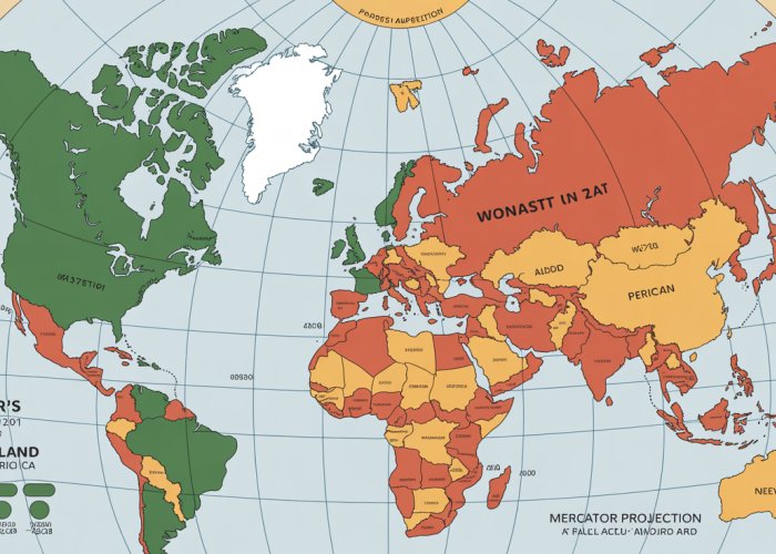
The Mercator projection, developed by Gerardus Mercator in the 16th century, is a cylindrical projection that preserves angles and shapes locally, making it ideal for navigation.
This conformality, or shape accuracy, made it invaluable to sailors for centuries.
However, the Mercator projection suffers from extreme area distortion, particularly at higher latitudes.
Greenland, for example, appears to be the same size as Africa on a Mercator map, when in reality, Africa is approximately 14 times larger.
This exaggeration of landmasses in the Northern Hemisphere has led to accusations of Eurocentrism, as it visually inflates the size and importance of European and North American countries.
The Gall-Peters Projection: Strengths and Weaknesses
In stark contrast, the Gall-Peters projection prioritizes area accuracy above all else.
While it accurately represents the relative sizes of countries and continents, it does so at the expense of shape.
This results in a map that is visually unfamiliar and, according to some, aesthetically displeasing.
Its strength lies in challenging the dominance of Eurocentric maps, particularly in social and political contexts.
Its weakness is the significant distortion of shapes, which critics argue hinders its general usability.
The Perspective of Gerardus Mercator
Gerardus Mercator was a 16th-century cartographer whose projection revolutionized navigation.
His primary goal was to create a map that preserved angles for accurate seafaring.
He wasn’t trying to make a statement about the relative importance of countries. His intention was to create a practical navigational tool.
His approach reflected the technological needs and priorities of his time.
More Than Just Geography: Social and Political Implications
Beyond its technical specifications, the Gall-Peters projection resonates deeply within social and political spheres.
Its significance transcends mere cartography, engaging with critical discussions about power, representation, and historical biases embedded within mapmaking.
The map’s impact stems from its explicit intention to challenge established Eurocentric perspectives and to promote a more equitable worldview.
Cartography as a Tool for Social Justice
The Gall-Peters projection is often championed as a tool for social justice due to its equal-area property.
By accurately portraying the relative sizes of countries and continents, it aims to correct what its proponents see as a systematic distortion present in maps like the Mercator projection.
The Mercator projection, while useful for navigation, significantly exaggerates the size of landmasses in the Northern Hemisphere, particularly Europe and North America, while shrinking the relative size of Africa and South America.
This visual distortion, whether intentional or not, has been criticized for reinforcing a Eurocentric worldview, where European nations appear larger and more dominant than they actually are in comparison to countries in the Global South.
The Gall-Peters projection directly confronts this perceived bias by prioritizing accurate area representation.
This accurate portrayal, proponents argue, allows for a more truthful understanding of global issues such as resource distribution, population density, and the impact of climate change.
These issues disproportionately affect countries in the Global South.
By visually leveling the playing field, the Gall-Peters projection seeks to empower these nations and amplify their voices in global conversations.
Challenging Eurocentric Perspectives
The decision to prioritize area accuracy in the Gall-Peters projection is not merely a technical one; it’s a conscious effort to deconstruct and challenge Eurocentric perspectives that have historically dominated cartography.
Traditional map projections, often developed in Europe, tended to place Europe at the center of the world, reinforcing its perceived importance and dominance.
The Gall-Peters projection disrupts this convention by presenting a different spatial arrangement, one that does not privilege any particular region.
By accurately depicting the size of countries in the Global South, the map challenges the visual hierarchy that has historically marginalized these regions.
This shift in perspective has significant implications for how we understand global power dynamics and the historical legacies of colonialism.
It encourages us to question the assumptions and biases that are often embedded within seemingly objective representations of the world.
The Power of Cartography in Shaping Perceptions
Maps are not simply neutral representations of geographical space; they are powerful tools that shape our understanding of the world and our place within it.
The choices made in map design, such as the projection used, the colors chosen, and the labels included, all contribute to the overall message conveyed by the map.
Cartography, therefore, is inherently a political act.
The Gall-Peters projection underscores this point by highlighting the ways in which map projections can be used to promote particular ideologies or worldviews.
By consciously challenging the dominant Eurocentric perspective, the map invites us to critically examine the ways in which maps have historically been used to reinforce power structures and perpetuate inequalities.
The map serves as a reminder that all maps are interpretations of reality, not simply reflections of it.
Correcting Biases: An Imperfect Solution
While the Gall-Peters projection is lauded for its equal-area accuracy and its commitment to social justice, it is not without its limitations.
The severe shape distortion inherent in the projection remains a significant point of contention, as it can render countries and continents unrecognizable.
This distortion can undermine the map’s usefulness in certain contexts, particularly those where visual recognition and spatial relationships are important.
Despite these limitations, the Gall-Peters projection serves as a valuable tool for raising awareness about the biases inherent in traditional map projections.
It prompts critical reflection on the ways in which cartography can be used to shape perceptions and reinforce power structures.
The map’s significance lies not in its perfection, but in its ability to spark dialogue and challenge conventional wisdom.
Ultimately, the Gall-Peters projection reminds us that maps are not objective truths, but rather, representations of the world that are shaped by human choices and perspectives.
The drive to challenge established norms and promote a more equitable representation of the world has fueled the Gall-Peters projection’s journey. Its impact extends beyond theoretical discussions, influencing practical applications and sparking ongoing debates about its effectiveness and suitability in various contexts.
A World of Difference: Current Usage and Relevance Today
Despite the controversies, the Gall-Peters projection has found its niche in various sectors, primarily driven by its commitment to accurate area representation. Its presence in education and advocacy highlights its enduring relevance in a world grappling with issues of global equity and representation.
Applications in Education
The Gall-Peters projection has been embraced by many educational institutions, particularly in geography, social studies, and development studies. Its use stems from a desire to expose students to alternative worldviews and to critically examine the biases inherent in traditional map projections like the Mercator.
By presenting a visually different representation of the world, educators aim to encourage students to question established norms and to consider the perspectives of countries in the Global South. It serves as a powerful tool for sparking discussions about colonialism, globalization, and the unequal distribution of resources.
Advocacy and Activism
Beyond the classroom, the Gall-Peters projection has become a symbol for advocacy groups and organizations focused on social justice and global development. These groups often utilize the map in their publications, websites, and campaigns to challenge Eurocentric narratives and to raise awareness about issues affecting the developing world.
The map’s visual impact is particularly effective in conveying the relative size and importance of countries in the Global South, thereby challenging the perceived dominance of Western nations. It serves as a constant reminder of the need for a more equitable and balanced global perspective.
The Enduring Debate: Merits and Demerits
Despite its adoption in certain circles, the Gall-Peters projection remains a subject of ongoing debate. Critics continue to point to its significant shape distortion as a major drawback, arguing that it compromises the map’s overall usability and aesthetic appeal.
Cartographers and geographers often emphasize the importance of balancing area accuracy with shape preservation, suggesting that other map projections may offer a more effective compromise. The debate highlights the inherent challenges of representing a three-dimensional sphere on a two-dimensional plane, and the need to carefully consider the intended purpose of a map when selecting an appropriate projection.
Ultimately, the Gall-Peters projection’s value lies not in its absolute "accuracy," but in its ability to challenge conventional thinking and to promote a more inclusive worldview. Its continued presence in education and advocacy demonstrates its lasting relevance in a world striving for greater equity and understanding.
Frequently Asked Questions About the Peter Projection Map
Here are some common questions about the Peter projection map, its purpose, and its significance.
What is the main difference between the Peter projection map and other world maps?
The Peter projection map prioritizes accurate representation of area. Unlike the Mercator projection, which distorts land sizes near the poles, the Peter projection map aims to show countries in their true relative size, even if it means sacrificing shape accuracy.
Why is the Peter projection map considered controversial?
Its unconventional appearance, with stretched and distorted shapes, makes it visually jarring to some. The Mercator projection, despite its area distortions, has been the standard for so long, so the Peter projection map’s attempt at area accuracy is often criticized for making countries look "ugly."
Does the Peter projection map distort anything at all?
Yes, it’s important to note that every 2D map projection inherently involves some form of distortion. While the Peter projection map accurately represents area, it distorts the shapes of countries, particularly stretching them vertically.
Why would someone choose to use the Peter projection map over the more common Mercator map?
The Peter projection map is favored by those who want to emphasize the relative sizes of countries, particularly developing nations, to counteract the perceived Eurocentric bias of the Mercator projection. Using the Peter projection map is often seen as a statement of social justice and geographical equality.
So, what do you think about the peter projection map? Pretty interesting, right? Hopefully, now you have a better understanding of its history and purpose. Go forth and explore the world with a fresh perspective!