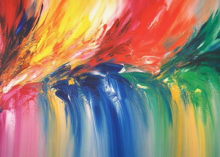
Discovering your hidden abilities begins with understanding how the world influences you, and one significant factor is the energy of colors. Color psychology, a field studied extensively by researchers at the Color Marketing Group, demonstrates that color elicits various emotional and psychological responses. Each hue carries its own inherent vibrational frequency; for example, Pantone, a leading authority on color, selects a ‘Color of the ‘X” that resonates with the current zeitgeist, highlighting the profound impact of color trends. Understanding the energy of colors and how to utilize them can ultimately enhance your personal growth and unlock your potential, allowing you to strategically navigate the landscape of your life with greater awareness and purpose.
Color. It’s more than just what meets the eye. It’s a pervasive force that subtly, yet powerfully, shapes our experiences. From the clothes we choose to wear to the hues that adorn our homes, color is a silent influencer, constantly at work in the background of our lives.
But what exactly is the "energy of colors," and how does it impact us? This exploration dives into the fascinating world where perception meets psychology, where art intertwines with ancient wisdom. We’ll unravel the threads of color’s influence, examining its historical roots, its psychological impact, and its practical applications in our daily lives.
Defining the "Energy of Colors"
The "energy of colors" refers to the perceived influence that different colors have on our emotions, moods, and even our physical well-being. It suggests that colors possess inherent qualities that resonate with us on a subconscious level, triggering specific responses.
This concept isn’t necessarily about literal energy in a scientific sense, but rather the subjective experiences and associations we’ve developed with each color. These associations are formed through a combination of cultural conditioning, personal experiences, and perhaps even some inherent biological predispositions.
Consider the instant feeling of warmth and cheerfulness associated with yellow, or the calming serenity evoked by blue. These aren’t random connections; they are deeply ingrained in our collective consciousness.
A Tapestry of Time: Historical and Cultural Significance
The symbolic use of color stretches back to the dawn of civilization. Ancient cultures revered certain colors, associating them with deities, power, and specific rituals.
-
Egyptians, for example, linked blue with divinity and royalty, using lapis lazuli extensively in their jewelry and sacred objects.
-
In many Eastern traditions, red symbolizes good fortune, happiness, and prosperity, frequently seen in celebrations and festivals.
-
Even the colors used in medieval art weren’t arbitrary; they carried specific religious and social meanings, understood by the audiences of the time.
Understanding this historical context provides a richer appreciation for the enduring power of color symbolism.
Navigating the Colorful Landscape: Scope of Our Exploration
In this article, we’ll journey through the multifaceted world of color, exploring its impact from various angles.
We will begin by looking at color psychology, which investigates how colors influence human behavior and emotion. From there, we’ll delve into color therapy, a holistic practice that employs color to promote healing and well-being. We’ll also touch upon the science behind color, briefly looking at the work of Newton and Goethe.
Finally, we’ll move into the practical, looking at the role of color in areas like interior design, art, productivity and even the more esoteric like Feng Shui and Aura.
Related Fields: Psychology and Therapy
Our exploration will naturally intersect with established fields like color psychology and color therapy. Color psychology is a field of study that examines the effects of color on human behavior and decision-making, primarily used in marketing and branding. Color therapy, also known as chromotherapy, is a complementary therapy that uses color and light to treat mental and physical health ailments. Although both are related to our topic, it is very important to understand their nuances and the fact that claims in color therapy should be reviewed critically.
By understanding the complex interplay of these elements, you can unlock a deeper appreciation for the impact colors have on your life and leverage them to create positive change.
The exploration of color’s historical and cultural significance provides a rich backdrop for understanding its deeper impact. But beyond ancient symbolism and societal norms, lies a more structured approach: the field of color psychology. This discipline attempts to dissect and codify the ways in which colors affect our thoughts, feelings, and actions.
Color Psychology: How Colors Influence Our Minds
Color psychology is the study of how colors affect human behavior. It’s a field that sits at the intersection of neuroscience, psychology, and marketing. While the subjective experience of color is undeniable, color psychology seeks to identify patterns and predict how different colors might influence us on a collective level.
Core Principles of Color Psychology
At its core, color psychology operates on the premise that colors are not just visual stimuli. They are potent carriers of meaning. These meanings are shaped by a combination of factors:
-
Evolutionary biology: Some color preferences might be rooted in our evolutionary past. For instance, the attraction to green could be linked to the association with fertile landscapes and readily available resources.
-
Cultural conditioning: Many color associations are learned through cultural norms and traditions. The meaning of white, for example, varies significantly across different cultures.
-
Personal experiences: Individual experiences with specific colors can also shape our emotional responses to them. A traumatic event associated with a certain color might trigger negative feelings, regardless of general associations.
It’s important to acknowledge that the effects of color can vary across individuals. However, certain color associations are consistently observed across large populations. These shared associations form the foundation of color psychology.
The Emotional Spectrum: Color Associations
While individual experiences play a role, general associations between colors and emotions are widely recognized. Understanding these associations can provide valuable insights into how colors can influence our mood and behavior.
Red: Energy, Excitement, Passion
Red is often associated with energy, excitement, and passion. It’s a stimulating color that can raise heart rate and blood pressure.
It evokes feelings of love and warmth, and is also linked to aggression and danger. Think of stop signs or emergency vehicles. The use of red in branding often aims to capture attention and convey a sense of urgency or power.
Blue: Calmness, Trust, Security
Blue is widely perceived as a calming and serene color. It evokes feelings of trust, security, and stability.
Think of the vastness of the ocean or the clarity of the sky. It is often used by corporations and banks to project an image of reliability and dependability. Blue can also represent sadness or melancholy, depending on the context.
Yellow: Happiness, Optimism, Creativity
Yellow is generally associated with happiness, optimism, and creativity. It’s a cheerful and energetic color that can boost mood and stimulate mental activity.
It is often used in marketing to attract attention and convey a sense of positivity and fun. However, it can also be associated with caution or deceit, so it’s essential to use it judiciously.
Green: Nature, Balance, Growth
Green is strongly linked to nature, balance, and growth. It symbolizes harmony, renewal, and environmental awareness.
It’s often used in branding for eco-friendly products and services to convey a sense of sustainability and health. Green can also represent envy or jealousy, but these associations are less dominant.
Color Psychology in Marketing and Branding
Color psychology is a powerful tool in the world of marketing and branding. Companies invest heavily in understanding how color choices can influence consumer behavior.
-
Brand recognition: Consistent use of specific colors can help consumers quickly identify and remember a brand. Think of Coca-Cola red or Tiffany’s blue.
-
Target audience: Colors can be strategically used to appeal to specific demographics. For example, brighter colors might be used to target younger audiences, while more muted tones might be used to target older consumers.
-
Purchase decisions: Colors can influence purchasing decisions by creating certain emotional responses. A product packaged in red might be perceived as more exciting and impulsive, while a product packaged in blue might be perceived as more reliable and trustworthy.
By carefully considering the psychological impact of color, businesses can create more effective marketing campaigns and build stronger brand identities.
However, it’s crucial to remember that color preferences and associations can vary depending on cultural context. A color that resonates positively in one culture might be perceived negatively in another.
Therefore, global brands must be mindful of these cultural nuances when designing their marketing materials.
Color Therapy: Healing with Hues
Having explored the psychological underpinnings of color, it’s natural to turn our attention to a practice that actively utilizes color as a tool for well-being: color therapy, also known as chromotherapy. But how does this work, and what are its purported benefits?
Color therapy operates on the premise that each color possesses a unique vibrational frequency that can influence our physical, emotional, and mental states. This section will delve into the world of chromotherapy, exploring its history, methods, and the critical considerations necessary when approaching this complementary practice.
Defining Color Therapy and its Historical Roots
Color therapy, or chromotherapy, is a holistic and complementary therapy that uses the visible spectrum of light and color to balance energy within the body. Proponents believe that imbalances in these energies can lead to physical and emotional ailments.
The practice is rooted in ancient traditions. Traces can be found in ancient Egypt, where sunlight was used for healing purposes, and in traditional Chinese medicine, which associates colors with specific organs and elements.
Ancient cultures understood the importance of sunlight. They also used colored gemstones and minerals for their supposed therapeutic properties. The modern resurgence of color therapy began in the late 19th and early 20th centuries.
How Different Colors Are Used in Color Therapy
The core principle of color therapy is that each color has distinct properties that can elicit specific responses in the body and mind. While individual experiences can vary, some general associations are commonly cited:
- Red: Believed to be stimulating and energizing. It’s often used to boost circulation and invigorate the body.
- Orange: Associated with creativity, joy, and emotional balance. Some practitioners use it to address depression and fatigue.
- Yellow: Linked to intellect, clarity, and optimism. Often employed to stimulate mental function and improve digestion.
- Green: Seen as a balancing and harmonizing color, promoting a sense of well-being.
- Blue: Believed to be calming and soothing. It’s used to reduce stress, lower blood pressure, and ease anxiety.
- Indigo: Associated with intuition and spiritual insight.
- Violet: Linked to transformation, healing, and spiritual awareness.
These colors are administered through various methods:
- Colored lights: Shining colored lights onto specific areas of the body.
- Colored fabrics: Wearing or being surrounded by colored clothing or linens.
- Colored water: Drinking water that has been "charged" with color by being exposed to colored light.
- Visualization: Meditating on specific colors to evoke desired emotional states.
Important Considerations and Disclaimers
It’s crucial to approach color therapy with a balanced and informed perspective.
While many individuals report positive experiences, it’s essential to recognize that scientific evidence supporting the efficacy of color therapy remains limited.
It’s not a substitute for conventional medical treatments. Always consult with a qualified healthcare professional for any health concerns.
Color therapy should be viewed as a complementary approach that may potentially enhance overall well-being when used alongside evidence-based medical care.
Always consult with a medical professional for diagnosis and treatment of any health condition.
Notable Figures in Color Therapy
While color therapy lacks robust scientific validation, several individuals have championed its principles and contributed to its development.
One prominent figure is Edwin Babbitt, who published "The Principles of Light and Color" in 1878. Babbitt detailed his theories on how different colors could be used to treat various ailments.
Another notable name is Dinshah Ghadiali, who developed the Spectro-Chrome system of color therapy in the early 20th century. His work involved using colored lights to treat a wide range of conditions.
These figures, while influential in the history of color therapy, are mentioned for historical context and should not be interpreted as an endorsement of their methods as scientifically proven treatments.
The Science Behind Color: Newton, Goethe, and the Color Spectrum
Having explored the world of chromotherapy, it’s worth examining the foundational scientific theories that underpin our understanding of color itself. While color therapy emphasizes the subjective and therapeutic aspects of color, a deeper dive into the work of scientific pioneers like Isaac Newton and Johann Wolfgang von Goethe helps to contextualize the objective reality of color.
Newton’s Prism: Unveiling the Spectrum
Isaac Newton’s groundbreaking experiments with prisms in the 17th century revolutionized our understanding of light and color. By passing sunlight through a prism, Newton demonstrated that white light is not a single entity, but rather a composite of all the colors of the rainbow.
This phenomenon, known as dispersion, revealed the now-familiar color spectrum: red, orange, yellow, green, blue, indigo, and violet. Newton’s meticulous observations and mathematical analyses laid the foundation for modern optics and forever changed how we perceive the nature of light.
He further demonstrated that these separated colors could be recombined with another prism to form white light again, solidifying his argument that color was an inherent property of light itself, not of the objects it reflected. This discovery was revolutionary, shifting the understanding of color from a property of objects to a characteristic of light.
Goethe’s Theory of Colors: A Humanistic Perspective
Nearly a century later, Johann Wolfgang von Goethe, the renowned German poet and philosopher, challenged Newton’s purely physical explanation of color with his own Theory of Colors (Zur Farbenlehre).
Goethe, while acknowledging Newton’s work, argued that color is not solely a product of light wavelengths, but also a subjective experience deeply intertwined with human perception.
Goethe focused on how humans perceive color and the psychological effects of different hues. His theory centered on the idea that color arises from the interaction of light and darkness, and that our eyes actively participate in the creation of color.
For example, Goethe noted that we tend to see colors appearing at the edges of light and dark areas and that these colors are fundamentally different from the colors Newton identified in the spectrum. His observations led him to a theory where color is not just a physical phenomenon but also a sensory one, deeply influenced by our perception.
Differing Perspectives, Lasting Significance
The contrasting approaches of Newton and Goethe sparked considerable debate and continue to offer valuable insights into the multifaceted nature of color.
Newton’s work provided a quantitative and objective framework for understanding color as a physical property of light. His findings are essential for understanding the physics of light, optics, and color technology.
Goethe’s theory, on the other hand, emphasized the subjective and psychological dimensions of color perception. His work continues to influence artists, designers, and psychologists who seek to understand the emotional and aesthetic impact of color.
While Newton focused on the quantifiable aspects of color, Goethe illuminated the role of human perception.
Ultimately, both perspectives contribute to a more complete understanding of color: one that encompasses both its physical properties and its profound influence on the human experience. By understanding both perspectives, we can better appreciate how color affects us.
Color in Everyday Life: Applications and Examples
Having explored the scientific and theoretical underpinnings of color, including Newton’s spectral discoveries and Goethe’s perceptual theories, it’s time to shift our focus to the tangible ways color manifests and influences our daily routines. From the walls that surround us to the art that inspires us, and even the spaces where we work, color plays a crucial, often subconscious, role. Let’s examine some practical applications of color knowledge and how a mindful approach to color can enhance various aspects of life.
Interior Design: Painting the Perfect Ambiance
Color is a cornerstone of interior design, possessing the power to transform spaces and evoke specific moods. Understanding how different colors interact and affect human psychology is vital for creating comfortable, functional, and aesthetically pleasing environments.
The right color palette can make a small room feel larger, a dark room feel brighter, or a sterile room feel warmer.
Consider the impact of color on different rooms:
Bedrooms: Serenity and Rest
Bedrooms are sanctuaries for relaxation and rejuvenation. Cool, calming colors such as blues, greens, and soft purples are ideal for promoting restful sleep and a sense of tranquility.
Avoid using vibrant, stimulating colors like red or bright yellow, as these can hinder relaxation.
Living Rooms: Social and Inviting
Living rooms are often the heart of the home, spaces for socializing and entertainment. Warmer colors like yellows, oranges, and earth tones can create a welcoming and convivial atmosphere.
However, balance is key.
Too much bright color can be overwhelming; incorporating neutral tones and accent colors can help create a harmonious balance.
Kitchens: Energetic and Appetizing
Kitchens are spaces for culinary creativity and can benefit from colors that stimulate appetite and energy. Warm colors like reds and oranges, in moderation, can be effective.
However, many modern kitchens utilize cooler tones like blues and greens for a fresh, clean aesthetic. Accent colors can then be added to inject personality and vibrancy.
Home Offices: Focus and Productivity
Home offices require colors that promote concentration and productivity.
Blues and greens are often recommended for their calming and focus-enhancing properties.
Avoid distracting or overwhelming colors that could hinder work. A neutral backdrop with strategic pops of color can strike the perfect balance.
Art: Color as a Language
Artists have long understood the power of color to communicate emotions, ideas, and symbolism. Color choices can significantly impact the viewer’s experience and interpretation of a work of art.
Emotional Expression
Color is a potent tool for expressing a wide range of emotions.
Warm colors like red and orange are often associated with passion, energy, and excitement, while cool colors like blue and green evoke feelings of calmness, peace, and melancholy.
Artists strategically use color to convey the emotional tone of their work, influencing the viewer’s emotional response.
Symbolism and Meaning
Colors can also carry symbolic meanings, often rooted in cultural traditions and historical associations. For example, white is often associated with purity and innocence, while black can symbolize mourning or mystery.
Artists may use color symbolism to add layers of meaning to their work, inviting viewers to delve deeper into the narrative and themes.
Color Harmony and Contrast
The way colors are combined in a work of art can also affect its overall impact. Harmonious color palettes create a sense of unity and balance, while contrasting colors can generate tension and visual interest.
Artists carefully consider the relationships between colors to create visually compelling and emotionally resonant compositions.
Productivity: Coloring Your Workspace for Success
The colors in your workspace can significantly affect your focus, creativity, and overall productivity. Understanding how different colors impact cognitive function can help you create an environment that supports your work goals.
Enhancing Focus
Cool colors like blue and green are known for their calming and focus-enhancing properties.
Painting walls or adding blue or green accents to your workspace can help reduce distractions and improve concentration.
Stimulating Creativity
If your work requires creativity and innovation, consider incorporating yellows and oranges into your workspace.
These warm colors can stimulate the mind and inspire new ideas. However, use these colors strategically, as too much can be overwhelming.
Promoting Energy and Motivation
Red can be a powerful motivator, but it is best used sparingly in the workplace. A red accent wall or a few red accessories can provide a boost of energy when needed, but too much red can lead to anxiety and restlessness.
The Importance of Balance
Ultimately, the best color scheme for your workspace is one that feels balanced and harmonious.
Consider your personal preferences, the nature of your work, and the overall atmosphere you want to create.
Experiment with different color combinations to find what works best for you.
Having examined the tangible ways color shapes our environments and creative expressions, we now turn our attention to more esoteric realms where color is believed to wield influence: Feng Shui and aura readings. These ancient practices, steeped in cultural tradition, offer unique perspectives on the interplay between color, energy, and well-being.
Feng Shui and Aura: Mystical Connections to Color
Feng Shui and aura readings represent fascinating intersections of color and spirituality. While rooted in distinct traditions, both systems ascribe profound meaning to color, positing that hues can impact energy flow, emotional states, and even physical health. It’s important to approach these beliefs with an open mind, acknowledging their cultural significance while maintaining a critical perspective.
Color’s Role in Feng Shui
Feng Shui, an ancient Chinese practice, aims to harmonize individuals with their environment. Color plays a vital role in this process, acting as a tool to balance qi (life force energy) and promote well-being. Specific colors are associated with the five elements (wood, fire, earth, metal, and water), and their strategic placement within a space is believed to influence various aspects of life, such as wealth, health, and relationships.
For example, green, representing the wood element, is often used in areas associated with growth and new beginnings, such as the east sector of a home. Red, linked to the fire element, can be used sparingly to add energy and passion to a space, but excessive use may lead to restlessness. Blue and black, representing the water element, are thought to promote calmness and introspection, making them suitable for bedrooms or meditation spaces. Earth tones, such as brown and beige, provide stability and grounding. Finally, white and metallic colors are associated with clarity and precision.
Ultimately, the goal of color application in Feng Shui is to create a balanced and harmonious environment that supports the well-being of its occupants. It is a practical and applicable element to consider in your home.
Understanding Auras and Their Colors
Auras are often described as electromagnetic fields surrounding living beings, and they are believed to emanate different colors that reflect an individual’s emotional, mental, and spiritual state. Aura readings, a practice found in various spiritual traditions, involve interpreting these colors to gain insights into a person’s character, health, and life path.
Each color in the aura is thought to correspond to specific qualities and energies. For example, a red aura may indicate passion, energy, or anger, while a blue aura often suggests calmness, intuition, or communication skills. A yellow aura could represent intellect, optimism, or creativity, and a green aura may signify healing, growth, or compassion. Violet is associated with spirituality, wisdom, and intuition.
However, it’s important to note that the interpretation of aura colors can vary depending on the practitioner and the specific belief system. Furthermore, the scientific basis for the existence and visibility of auras remains a subject of debate.
Cultural Significance and the Need for Critical Evaluation
Both Feng Shui and aura readings are deeply embedded in cultural traditions and belief systems. They offer frameworks for understanding the world and our place within it, and they provide tools for personal growth and well-being.
It’s crucial to acknowledge that these practices are often based on subjective interpretations and may not align with scientific understandings of color and energy. While they can be valuable sources of inspiration and self-discovery, it’s important to approach them with a critical and discerning eye.
The power of Feng Shui and aura readings lies in the intention and personal connection we bring to them. By understanding the cultural contexts and symbolic meanings associated with different colors, we can use these systems to enhance our lives in meaningful ways. If you’re interested in Feng Shui or aura readings, it may be a good idea to find a consultant or expert to assist you.
FAQs: Unlocking Your Potential Through the Energy of Colors
How can understanding the energy of colors help me?
Understanding how different colors affect you can help you make conscious choices in your environment, wardrobe, and even your daily activities. This awareness can enhance your mood, focus, and overall well-being, allowing you to unlock your potential more effectively.
Which color is best for boosting my creativity?
While individual preferences vary, blue is often associated with calm focus and mental clarity, which can be beneficial for creative endeavors. Yellow also can be used to spark creativity because it represents optimism. Experiment with different colors to discover what works best for you.
Is the energy of colors scientifically proven?
The direct "energy" of colors, as described in this article, isn’t typically viewed in a scientific context. However, research does show colors influence our perceptions, emotions, and behaviors.
How can I practically incorporate the energy of colors into my life?
Start by noticing the colors you’re drawn to and how they make you feel. Experiment with incorporating those colors into your wardrobe, home décor, or even your workspace. Pay attention to how these color changes affect your mood and productivity.
So, go ahead and experiment with the energy of colors in your own life! See how they impact your mood, your creativity, and your overall well-being. You might be surprised at the power they hold!