The central limit theorem provides a mathematical foundation for understanding the probability bell curve. This fundamental distribution, often visualized using tools like Excel’s built-in statistical functions, describes the distribution of many natural phenomena. The shape of the probability bell curve is significantly relevant in hypothesis testing conducted within Six Sigma methodologies, ensuring process improvements. Essentially, mastering the probability bell curve and its characteristics unlocks valuable insights for effective decision-making across diverse fields.
Decoding the Probability Bell Curve: Essential Insights
This article aims to explain the "probability bell curve" – also known as the normal distribution – in a clear and concise manner. It will cover what it is, why it’s important, and how it’s used in various fields.
What is the Probability Bell Curve?
The probability bell curve is a visual representation of how data is distributed around its average value. Imagine a dataset; the bell curve illustrates the likelihood of encountering a specific value within that set.
Defining Normal Distribution
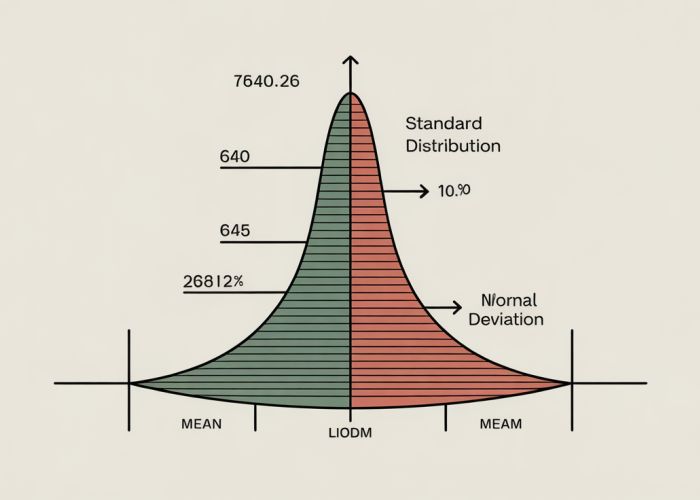
The technical term for the probability bell curve is the "normal distribution." It’s a symmetrical, bell-shaped curve where the highest point represents the mean (average) value. This peak indicates that the most frequent data points cluster around the mean. The curve then tapers off symmetrically on either side of the mean. This tapering shows that values further away from the mean are less likely to occur.
Key Characteristics
Here’s a breakdown of the characteristics that define the probability bell curve:
- Symmetry: The curve is symmetrical around the mean. If you were to draw a line down the middle, both halves would be mirror images.
- Mean, Median, and Mode: In a perfect normal distribution, the mean, median (middle value), and mode (most frequent value) are all equal and located at the center of the curve.
- Standard Deviation: This measures the spread of the data. A small standard deviation indicates that the data is tightly clustered around the mean, resulting in a narrow, tall bell curve. A large standard deviation suggests that the data is more spread out, leading to a wider, flatter curve.
- Area Under the Curve: The total area under the curve represents 100% of the data. This is crucial for calculating probabilities.
Understanding Standard Deviation and the 68-95-99.7 Rule
Standard deviation plays a critical role in interpreting the probability bell curve. It allows us to estimate the probability of a data point falling within a certain range of the mean.
The 68-95-99.7 Rule (Empirical Rule)
This rule provides a simple way to understand the probability distribution within a normal distribution:
- 68%: Approximately 68% of the data falls within one standard deviation of the mean (on either side).
- 95%: About 95% of the data falls within two standard deviations of the mean.
- 99.7%: Almost all (99.7%) of the data falls within three standard deviations of the mean.
Practical Example
Let’s say the average height of adult women is 5’4" (64 inches) with a standard deviation of 2.5 inches. Using the 68-95-99.7 rule:
- 68%: About 68% of women are between 61.5 inches and 66.5 inches tall (64 +/- 2.5 inches).
- 95%: About 95% of women are between 59 inches and 69 inches tall (64 +/- 2*2.5 inches).
- 99.7%: Nearly all women are between 56.5 inches and 71.5 inches tall (64 +/- 3*2.5 inches).
Why is the Probability Bell Curve Important?
The probability bell curve is important because it appears frequently in real-world scenarios and statistical analysis.
Applications in Various Fields
Here are some examples of where normal distributions are used:
- Statistics: Fundamental to hypothesis testing and confidence interval estimation.
- Finance: Used in portfolio management to assess risk and return.
- Healthcare: Used to analyze patient data and understand the distribution of diseases.
- Education: Used to grade exams and evaluate student performance.
- Engineering: Used to analyze manufacturing processes and ensure quality control.
Table Summarizing Key Applications
| Field | Application |
|---|---|
| Statistics | Hypothesis testing, confidence intervals |
| Finance | Risk assessment, portfolio optimization |
| Healthcare | Analyzing patient data, epidemiology |
| Education | Grading, performance evaluation |
| Engineering | Quality control, process analysis |
Factors That Can Affect the Shape of the Curve
While the ideal normal distribution is perfectly symmetrical, real-world data may not always fit this perfectly. There are factors that can skew the curve or affect its shape.
Skewness
Skewness refers to the lack of symmetry in a distribution.
- Positive Skew: The tail of the curve extends further to the right (higher values). This indicates that there are more data points with relatively low values and fewer with very high values.
- Negative Skew: The tail of the curve extends further to the left (lower values). This suggests there are more data points with relatively high values and fewer with very low values.
Kurtosis
Kurtosis describes the "tailedness" of the distribution.
- High Kurtosis (Leptokurtic): The curve has a sharper peak and heavier tails. This implies that there are more values concentrated around the mean and more extreme values compared to a normal distribution.
- Low Kurtosis (Platykurtic): The curve has a flatter peak and thinner tails. This suggests that the data is more evenly distributed and there are fewer extreme values.
Decoding the Probability Bell Curve: FAQs
Got questions about the probability bell curve? Here are some common ones explained simply.
What exactly does a probability bell curve show?
A probability bell curve, also known as a normal distribution, visually represents the distribution of data points. It shows how often different values occur within a dataset, with the highest point representing the most frequent value (the mean). Data values are typically concentrated near the mean, tapering off symmetrically towards the tails.
What makes the probability bell curve so important?
It’s important because many naturally occurring phenomena and statistical measures tend to follow this distribution. It’s a foundational concept in statistics, used for hypothesis testing, confidence intervals, and understanding variability. Understanding the probability bell curve allows for informed decision-making based on data.
What happens to the curve if the standard deviation changes?
The standard deviation measures the spread of the data. If the standard deviation increases, the probability bell curve becomes wider and flatter, indicating greater variability. A smaller standard deviation results in a narrower and taller curve, showing that data points are clustered more closely around the mean.
Can all data be represented by a probability bell curve?
No, not all data follows a normal distribution. Data can be skewed (asymmetrical) or have different shapes. It’s crucial to assess whether a probability bell curve is appropriate for a particular dataset before applying statistical methods based on this assumption.
So there you have it! Hopefully, you now have a better grasp of the probability bell curve. Go forth and analyze! I think you’ll find it fascinating. Happy analyzing!