Color theory, a cornerstone of artistic expression, provides the foundational understanding necessary to appreciate subtleties like the complement of red. Johannes Itten, a influential figure in the Bauhaus movement, dedicated significant attention to color interactions and their psychological impacts, furthering studies and understandings of color wheels and harmonies. Exploring the complement of red also requires familiarity with resources such as the Munsell Color System, a method for specifying colors based on hue, value, and chroma. One of the most interesting findings shows that the human eye perceives green, not brown, as the complement of red, affecting visual harmony and design choices.
Unlocking the Secrets of Red’s Complement: A Deep Dive into Color Theory
Understanding the "complement of red" is crucial for artists, designers, and anyone interested in color harmony. This article will explore the concept of complementary colors, focusing specifically on red and its counterpart, and how understanding this relationship can enhance visual appeal.
The Foundation: Understanding Color Theory Basics
Before diving into red’s complement, it’s essential to grasp some fundamental color theory principles. These principles provide the context for understanding why certain color pairings are inherently pleasing to the eye.
The Color Wheel: A Visual Guide
The color wheel is the cornerstone of color theory. It’s a visual representation of colors arranged according to their chromatic relationship. The most common version is the 12-color wheel, which includes:
- Primary Colors: Red, yellow, and blue. These are considered the base colors, as they cannot be created by mixing other colors.
- Secondary Colors: Orange, green, and violet. These are created by mixing two primary colors (e.g., red + yellow = orange).
- Tertiary Colors: Colors created by mixing a primary and a secondary color (e.g., red + orange = red-orange).
Defining Key Color Characteristics
Understanding these characteristics will help understand how colors interact with each other.
- Hue: Refers to the pure color name (e.g., red, blue, green).
- Saturation: Refers to the intensity or purity of a color. High saturation colors are vivid, while low saturation colors appear muted or dull.
- Value: Refers to the lightness or darkness of a color. Adding white increases value (creating tints), while adding black decreases value (creating shades).
Red and Its Complement: A Closer Look
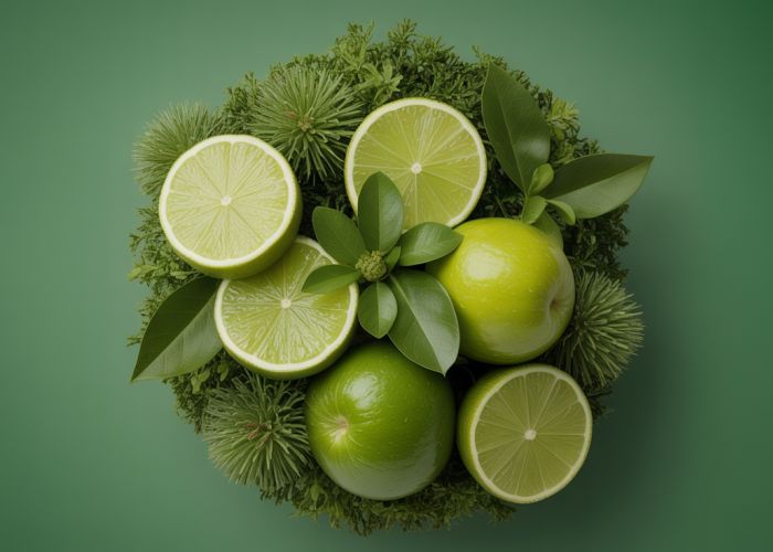
The "complement of red" is the color that sits directly opposite red on the color wheel. This opposite is green. This relationship is the key to understanding complementary color schemes.
Why Red and Green Work Together
The visual appeal of red and green pairings stems from several factors:
- Simultaneous Contrast: When red and green are placed next to each other, they intensify each other’s appearance. This is because each color stimulates the opposite color receptors in the eye.
- Visual Balance: Red is a warm color, associated with energy and excitement. Green is a cool color, associated with calmness and nature. This contrasting nature creates a sense of balance and visual interest.
- Avoiding Chromatic Aberration: While vibrant red and green combinations can create a stunning effect, extreme saturation in both colors can create unpleasant visual vibrations or afterimages. This is known as chromatic aberration. Modifying the saturation and value of one or both colors can mitigate this effect.
Exploring Variations of Red and Green
The term "red and green" isn’t limited to the pure hues found on a standard color wheel. You can use various tints, shades, and tones of red and green to achieve different aesthetic effects. Consider these possibilities:
| Red Variation | Green Variation | Resulting Effect |
|---|---|---|
| Burgundy | Olive Green | Sophisticated, earthy, and elegant |
| Pastel Pink | Mint Green | Light, airy, and youthful |
| Crimson | Forest Green | Rich, dramatic, and festive (often associated with Christmas) |
| Rust Red | Sage Green | Rustic, vintage, and calming |
| Tomato Red | Chartreuse Green | Bold, modern, and energetic |
Examples of Red and Green in Art and Design
Countless examples illustrate the successful use of red and its complement:
- Logos: Many companies utilize red and green in their logos to create a memorable and visually appealing brand identity.
- Product Packaging: Red packaging with green accents, or vice versa, can help products stand out on shelves.
- Photography: Using red and green elements in a photograph can create a striking and dynamic composition.
- Website Design: Strategically using red and green can draw attention to key elements and create a cohesive visual experience.
- Interior Design: Adding red accents to a room with a predominantly green color scheme (or vice versa) can create a balanced and visually stimulating space.
Practical Applications of Understanding Complements
Knowing about the "complement of red" and complementary colors in general can be applied to many aspects of design and everyday life.
- Creating Harmony: Use complementary color schemes to create visually appealing designs and environments.
- Adding Contrast: Employ complementary colors to highlight specific elements and draw attention to certain areas.
- Balancing Visuals: Use complementary colors to create a sense of balance and visual harmony in your work.
- Evoking Emotions: Use the psychological associations of colors, in combination with their complements, to evoke specific emotions and feelings.
FAQs: Unveiling Red’s Hidden Complement
Here are some frequently asked questions to further illuminate the power and possibilities revealed in our color theory exploration of Red and its complement.
What exactly is the complement of red?
The complement of red, according to color theory, is green. When placed next to each other, red and green create the highest contrast, making both colors appear more vibrant.
Why is understanding the complement of red important for design?
Knowing that green is the complement of red is crucial for creating visually appealing and balanced designs. It helps you make informed decisions about color palettes, ensuring harmony or intentional contrast.
Can the complement of red be varied or slightly adjusted?
Yes, while green is the general complement of red, the specific shade of green that works best can vary depending on the shade of red you’re using. Think about subtle variations to achieve the desired effect.
What are some common examples of using red and its complement effectively?
Christmas decorations often utilize red and green. Consider how the bright red of a poppy flower is accentuated by its green stem and leaves, or even how video games use red for a hero and green for an enemy for the perfect contrast.
So, there you have it – a deeper look at the complement of red and why it’s so important. Hopefully, this gives you some new ideas for your next project or just helps you see color in a whole new light. Keep experimenting and have fun!